


Niccokick
"Lost Souls Play R'n'R" LP
What: Album packaging design.
Role: Art direction, graphic design.
Year: 2023. Client: Niccokick.
Year: 2023. Client: Niccokick.

In this project, I had the opportunity to revisit and reimagine the visual identity for Niccokick’s “Lost Souls Play R’n’R,” a special vinyl release that marks the first-ever LP compilation of their “Turn 27 EP” and “Run! Run! Run! EP.” Having originally designed the packaging for these EPs in CD format 20 years ago, it was both a privilege and a unique challenge to adapt and evolve the artwork for this vinyl reissue.
My role spanned art direction, graphic design, and the conceptual framework, including the naming of the album, a nod to one of their tracks that beautifully encapsulates the essence of these recordings.
This project was about more than just designing an album cover; it was about creating a visual experience that complements the music, respects the band’s legacy, and appeals to both long-time fans and new listeners. Through “Lost Souls Play R’n’R,” I aimed to showcase the power of design in bringing music to life in a tangible, visually captivating way.


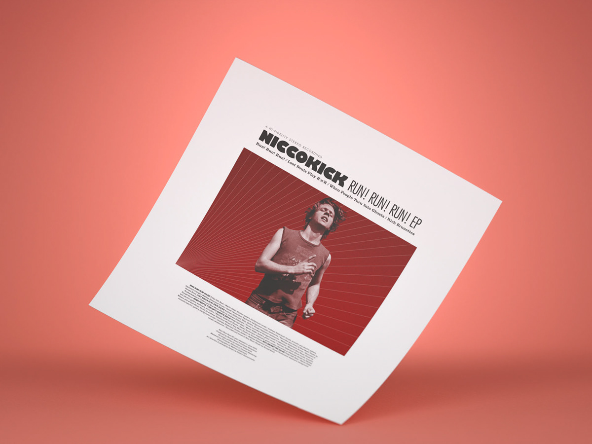
Faced with the initial suggestion by the band to simply replicate the original CD artwork, I advocated for a fresh direction instead that would honor the band’s lo-fi indie rock essence while presenting something entirely new. The front cover features an intimate moment from a live performance, subtly altered to fit the album’s feel. For the back cover, I embraced minimalism, focusing on the tracklist surrounded by generous negative space. A strategically cropped photo adds a layer of intrigue, hinting at the depth of the album’s content. Rather than placing the original EP graphics directly on the cover, these elements found a new home in a 2-sided insert, providing fans with a tangible link to the past alongside additional album details.
I chose a live photo from my work archives for the front cover, treated to embody the lo-fi aesthetic, with the band name and album title bluntly overlaying the image. The back cover contrasts with its minimalist design, prioritizing negative space and tracklisting, and incorporating a hard-cropped photo to spark curiosity and engagement. Rather than reusing the EP graphics on the cover, I included them on a 2-sided 300×300 mm insert, adding depth and narrative to the packaging.


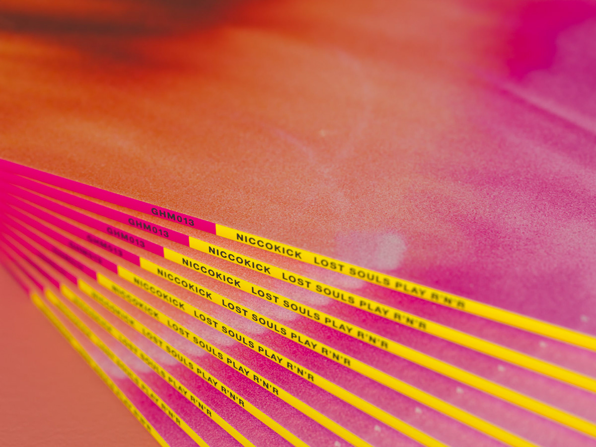
A special touch was the inclusion of graphics I had originally designed for the band’s merchandise 20 years back, now adorning the vinyl labels, weaving past and present together. The choice of an orange vinyl not only visually complements the cover art but also injects a vibrant splash of color that mirrors the energy of the music.
Typography played a significant role in the packaging’s aesthetic, with typefaces from my Generic Font Collection developed under my typeface design moniker “More Etc.”. These fonts were carefully chosen for their compatibility with the album’s aesthetic, effectively marrying the visual and textual elements of the packaging design.


In connection with the release of the album, the band did a number of gigs again for the first time in many years. The old shirts that I designed for the band 20 years earlier were printed in a new edition and became successful merchandise once again.


Thank you for watching! :)


